


Photo by Charles Cottle
Following the rules of photographic composition usually renders idealized versions of reality. Anyone learning to produce pleasant looking photographs will consider the “rule of thirds,” the importance of lighting, the importance of the foreground and background, the elimination of clutter, and so forth. Yet, as beautiful as many of the resulting photographs might be, they fall short of a more representational view of reality. Compare, for example, the picture above of Santo Domingo de Guzmán church in Oaxaca with the picture below of the same church. The image above is similar to almost all those you will likely see that promote the tourism of Oaxaca. The image below is one you will almost never see. The one above follows the rules of composition. The one below breaks a number of those rules, but gives you a better feel of what Oaxaca is like and the church’s place in it.
Which photo is better? Many would rush to say it is the one above. I’m not so sure.
Versión en español –
Siguiendo las reglas de composición fotográfica por lo general resulta en versiones idealizadas de la realidad. Cuaquiera quien aprenda a producir fotos agradables considera la regla de tercios, la importancia de la luz, la importancia del primer plano y el fondo, la eliminación del desorden, y muchas cosas así. A pesar de la belleza que resulta en muchas de estas fotos, ellas pierden una vista de la realidad más representiva. Compare, por ejemplo, la foto arriba de la iglesia Santo Domingo de Guzmán en Oaxaca con la foto abajo de la misma iglesia. La imagen arriba es como casi todas que se ven para promover el turismo de Oaxaca. La imagen abajo es una que casi nunca se ve. La de arriba sigue las reglas de composición. La de abajo rompe muchas de las reglas, pero le da a uno un sentido mejor de como es Oaxaca y como se ve la iglesia en su contexto.
¿Qué foto es mejor? Muchos van a decir que la de arriba es mejor. ¿Yo? No estoy tan seguro.
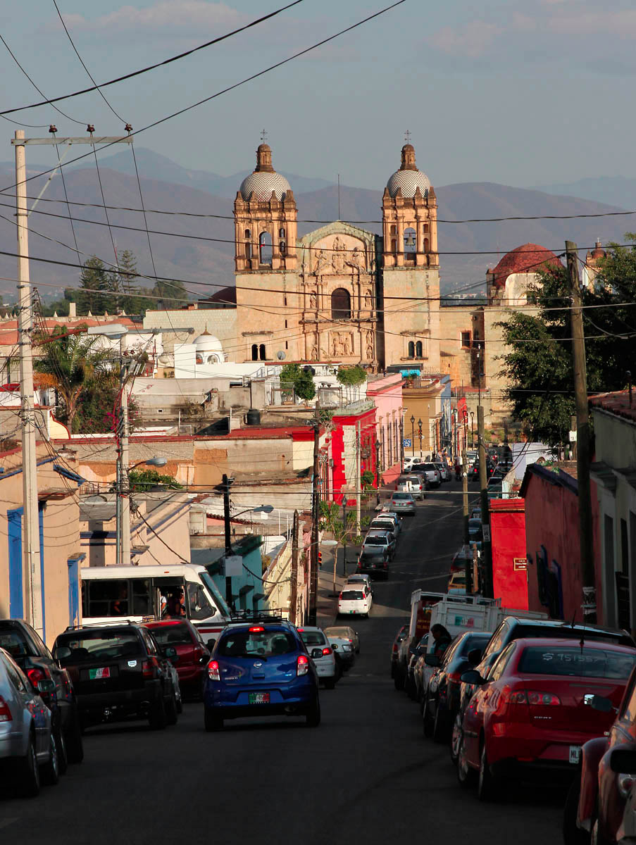
Photo by Charles Cottle

Very good question about the two photographs; as you may suspect, I’m a fan of the more cluttered and more realistic image (#2). Mike
LikeLike
I’ve been thinking about this issue for some time now. As you know, Walker Evans and other photographers working for the Farm Security Administration in the 1930’s were criticized for making extreme poverty look so “attractive.” Perfectly composed and exposed photographs created an image of reality that many felt betrayed the mission of the photography project itself. While most tourism photography doesn’t have the same impact, there is no question that it tends to idealize the subject in front of the lens.
LikeLike
Hi,… Both of the photographs are equal in quality and concepts. my opinion is all depend on individual interest. Thank you for sharing. Those are amazing !
LikeLike
Thanks for taking the time to stop by my blog. I agree with your point of view, but most people I know prefer the first photo. And thanks for the kind words about the photos.
LikeLike
You are welcome. Yes, most people do. I usually do visit places in both attractions and I like to smell of both the fragrant of Touristic places and places hidden behind it. 🙂
LikeLike
Love the 2nd – just wish there were fewer cars – everywhere.
LikeLike
Yes, you don’t see the cars in the tourist info or in most images on the Web, but they are everywhere. The historic district of Oaxaca, which you see in the 2nd photo, is developing a real air quality problem. And, of course, there is the noise pollution of so many cars, buses, and horns. I have a video of Oaxaca traffic that I may post later. It’s not a video that would make you want to go there. Yet it remains my favorite city in Mexico.
LikeLike
I like both…the second one show what Mexico is about
LikeLike
Yes – Increasingly I’m interested in pursuing the second line of exploration. That one is more controversial, however.
LikeLike
I think is more controversial but is true to the place, but you did make me think we just take photos in certain way, and this photo tells a story. I changed the way of seeing things now, the more your travel or live the more you learn.
LikeLike
Yo tome la foto por el otro lado es interesante como vemos las cosas diferente
LikeLike
Yes – good points. All those wonderful rules, I love to work with for beautiful photos – the media construct, so to speak . . . and more ften than not, it is just what is just out of view of the lens that holds the majority of reality – or at least the rest of the picture! Good posy . . . love your blog.
LikeLike
Thanks for the kind comment. I like the way you put it . . . “the media construct.” It’s odd that the standard approach often obscures a deeper truth about the subject.
LikeLike